

Marketplace for Sneakers


Role - UX/UI Designer and Researcher
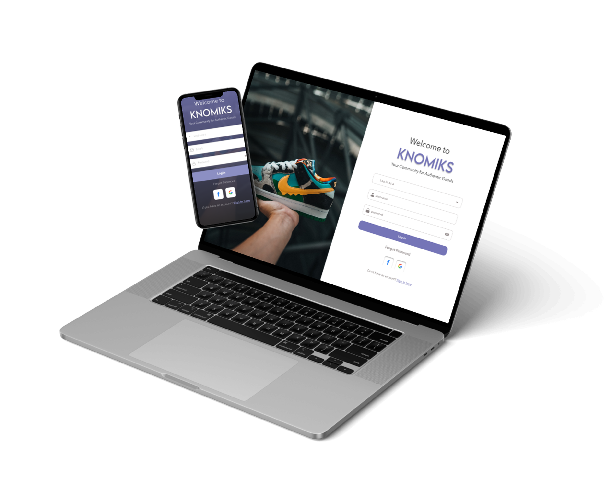
What is Knomiks?
Knomiks is a sneaker marketplace that brings different sneaker brands and sellers together in one place. It helps users easily discover, compare, and shop for sneakers through a simple and user-friendly experience.
Why did clint hire me as a UI/UX Designer & Researcher?
Clint already had an existing website and initial designs, but the platform was facing major usability and user experience challenges. Users found the website outdated, difficult to navigate, and confusing during the checkout process, which affected overall engagement and conversions.
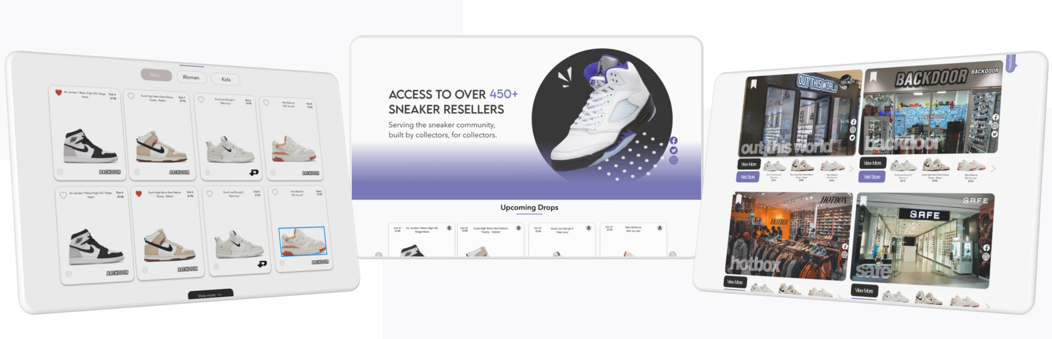
Previous Designs
The client was looking for a fresh and modern redesign that could improve usability while creating a smoother shopping experience.
🛠️How I Fixed the Knomiks Website and Web App (UX/UI Redesign)
I approached the redesign by first fixing the structure and usability problems, and only then improving the visual design. The goal was to create a clear, intuitive, and conversion-focused marketplace experience.
1. UX Audit — Identifying Core Problems
I started by analyzing the existing website to understand user friction points.
What I analyzed:
Navigation structure
User flow
Layout consistency
CTA visibility
Content hierarchy
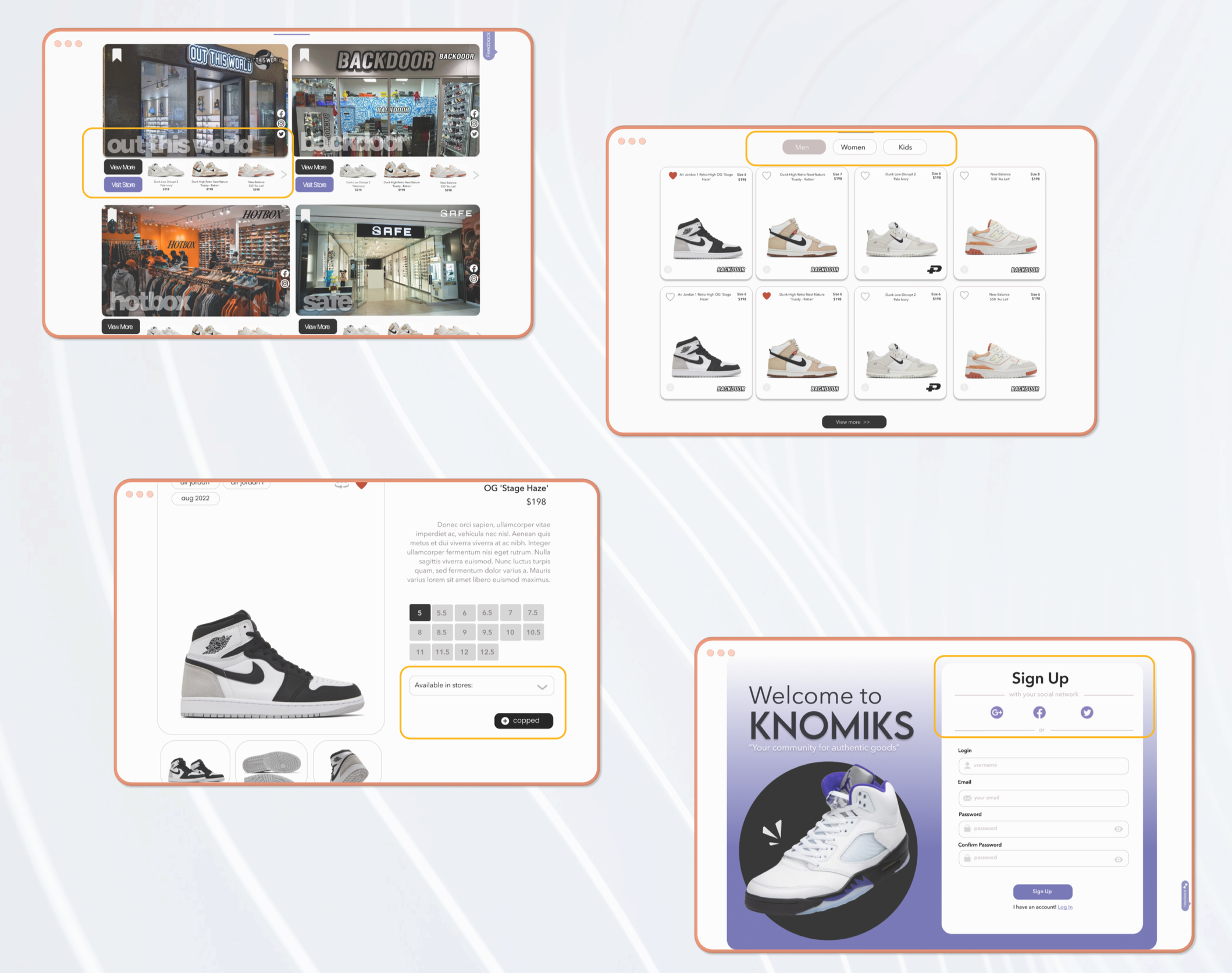
Navigation structure
Content hierarchy
User flow
Layout consistency
CTA visibility
🎯 Outcome:
I discovered that the main issue was not just visual design, it was a broken information structure and unclear hierarchy.
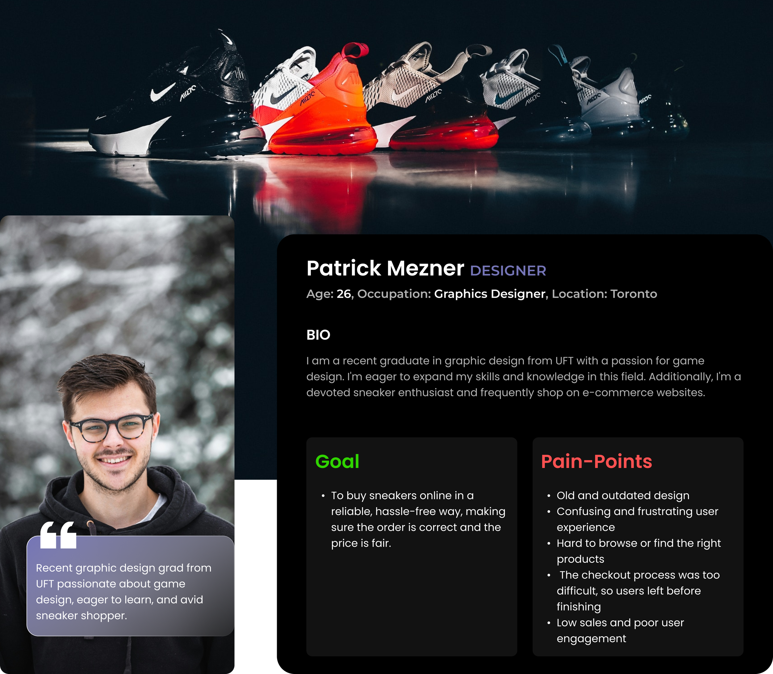
After identifying the main usability issues through the UX audit, I conducted surveys and interviews with 17 users to better understand their needs, frustrations, and shopping behaviour. The feedback helped uncover key pain points and guided the redesign decisions.
Here's what I learned:


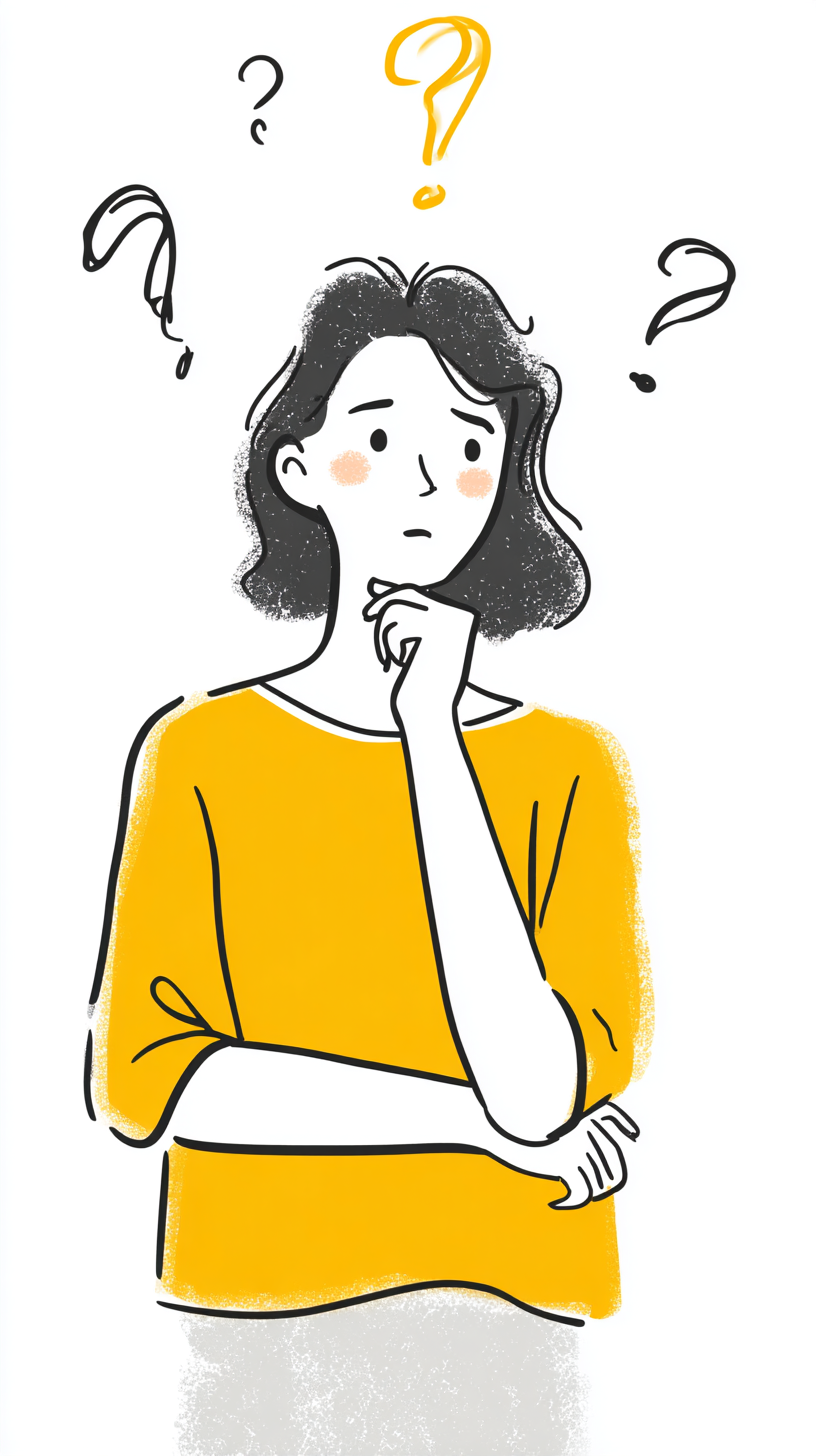


User Persona


🛑 Problem Statement
The Knomiks e-commerce platform needed a complete redesign to address serious usability issues. The outdated interface, limited features, and a poor checkout experience were frustrating users and causing high drop-off rates. To improve engagement, increase conversions, and stay competitive, a more modern, user-friendly solution was essential.

🔍 Pain Points:
Old and outdated design
Confusing and frustrating user experience
Hard to browse or find the right products
The checkout process was too difficult, so users left before finishing
Low sales and poor user engagement
✅ Solution
To solve the key problems users faced, I focused on a full redesign that improved usability, functionality, and trust.
Here's how:
Modernized the outdated design
→ Gave the website a clean, updated look to meet current user expectations and make it visually appealing.Improved overall user experience
→ Simplified layouts, better use of space and visuals, and clearer messaging to reduce confusion and frustration.Expanded functionality
→ Added advanced filters, better product categorization, and smoother navigation to help users easily find what they need.Fixed checkout issues
→ Redesigned the entire checkout process to reduce steps, add helpful info (like size guides), and make it mobile-friendly, leading to fewer drop-offs.Built a responsive, mobile-first design
→ Ensured the site works well on all devices so users can browse and shop from anywhere.Increased user confidence and trust
→ Highlighted reviews, return policies, and guide info to make users feel secure while shopping.Boosted engagement and conversions
→ All these improvements helped create a smooth, enjoyable shopping experience, encouraging more users to complete purchases.
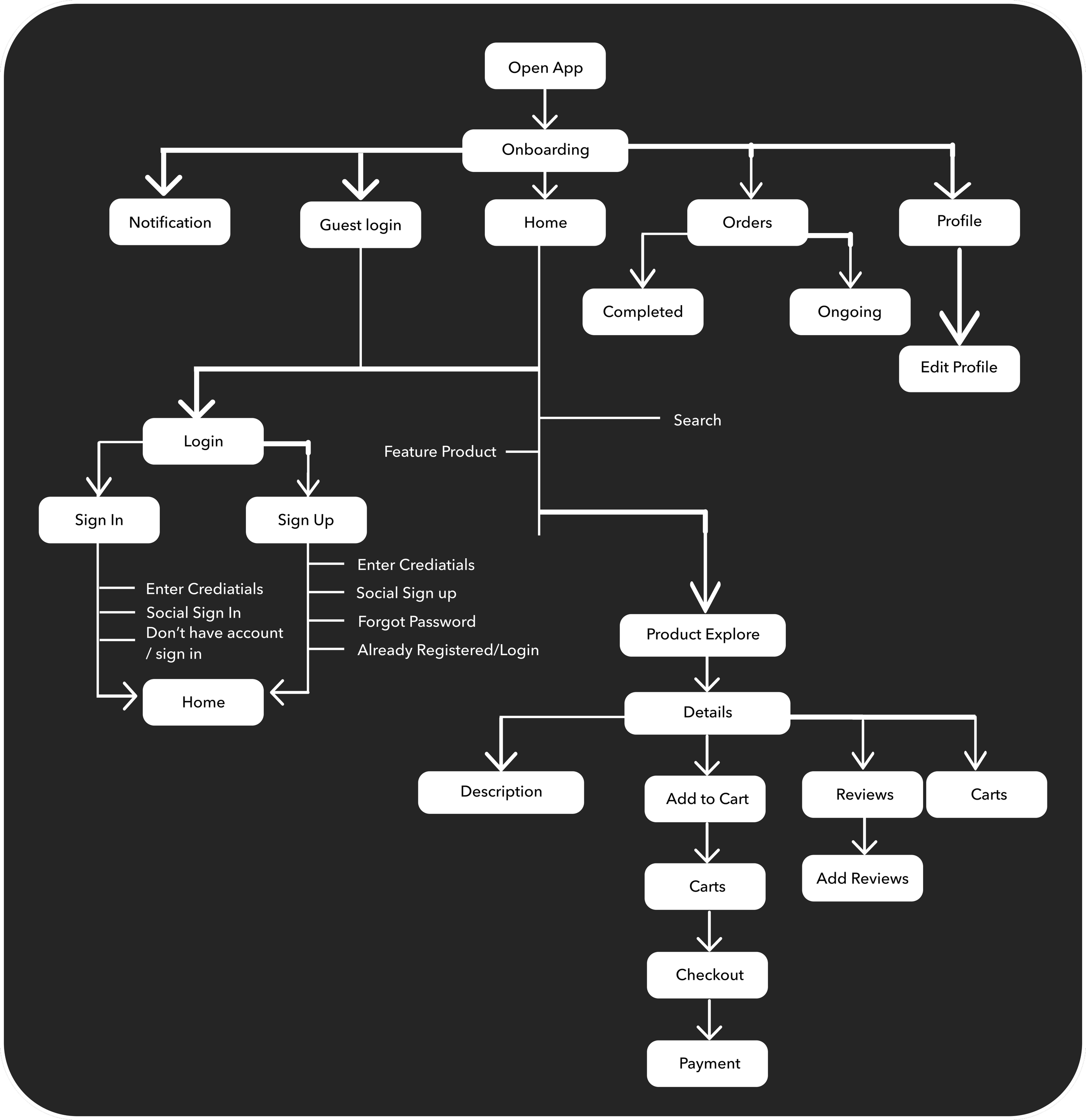
User Flow
Designed and mapped sequential steps users take on a website to optimize their experience and task completion.

Design System
This Design System consists of -
Colour Style, Test Style, Buttons, Layout Grid, Auto-layout, Cards, Ratings, Review, Variants, Icon Pack
Components


High-Fidelity Prototype
